

Word Wanderers : A Spherical Data Visualization
Project TypeData Visualization/ Museum Experience Design/ Team Project
YearSep–Dec 2024
LocationDimentionsRaleigh,NC
2048 * 1024 px
My RoleData Research & Analysis / Storyline Development / Narration Writing / Animation & Visual System Co-Design
Software and techniques usedSoftware: Adobe Illustrator, Adobe After Effects, Figma, Google Sheets
Techniques: Data Cleaning & Categorization, Temporal Data Mapping, Motion Design, Narrative Structuring, Visual System Development for Spherical Displays
Project DescriptionWord Wanderers is an immersive Science-on-a-Sphere visualization created for the Museum of Life and Science in Durham, NC. Our project transforms 100 years of linguistic data into a global narrative that helps visitors explore how languages shift in response to major world events, wars, migration, globalization, and technological change. By blending data, storytelling, and spherical animation, we aimed to make the evolution of languages both accessible and emotionally resonant.
Data VisualizationTarget Audience
The project is designed for museum visitors aged 12 and above who are curious about global cultures, human history, and the evolution of languages. The installation also targets families, school groups, and general audiences seeking an engaging, visually driven learning experience.
Design Problem
Although linguistic change is deeply intertwined with global events, it is often presented through static charts or academic reports that feel distant and difficult to interpret. Our challenge was to transform a century of complex language data into a compelling, narrative-driven experience that could unfold naturally on a spherical display, an environment that demands careful spatial planning and visual clarity. The project also required us to reveal meaningful connections between global linguistic shifts and the historical events that shaped them, while ensuring the experience remained accessible and engaging for museum visitors who may have little background in linguistics or world history.
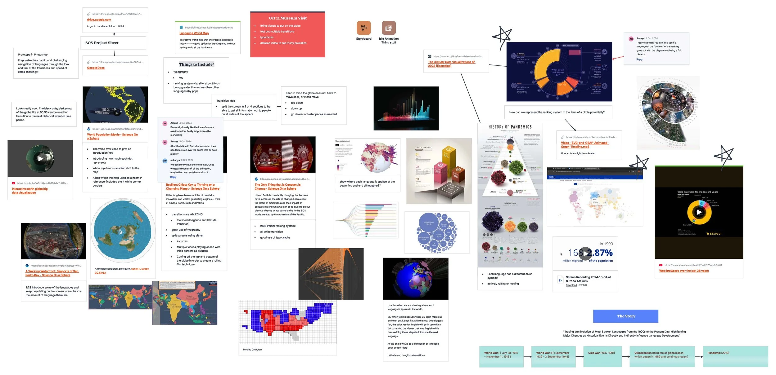
Design Process
1. Topic Exploration and Dataset Review
Our team began by reviewing NOAA’s Science-on-a-Sphere catalog, which primarily contains environmental datasets. We realized there was a gap: few datasets explored culture, people, or global human stories.
As a multicultural team, we were drawn to the idea of languages as living systems shaped by history. This became our thematic direction.
2. Data Collection & Analysis
We collected and analyzed the top ten most spoken languages across the past century using data from Ethnologue. As I traced year-by-year population changes, a critical pattern emerged: every major shift in global language rankings corresponded directly with a significant world event.
Through deeper analysis, we saw clear connections. After World War I, for example, the number of Italian speakers dropped in global ranking due to territorial changes and large-scale migration. Similarly, both German and Japanese showed steady declines following World War II, reflecting the political restructuring and population losses of the period.
In contrast, the era of globalization has brought rapid growth in the number of English speakers. English eventually surpassed Chinese to become the world’s most widely spoken language, not because of population size alone, but because technology, international trade, and the internet amplified its global reach.
One of the most unexpected findings to emerge from the pandemic period was that, for the first time in nearly a century, the growth of Chinese speakers plateaued, illustrating how global health crises can alter demographic and linguistic trends.
These insights became the foundation of our narrative. To better understand the forces shaping language, we categorized historical events into key influence groups, including war, migration, geopolitics, education, technology, globalization, and health crises. This structure later guided both our storyline and our visual design decisions.
3. Narrative Structure & Storyline Development
As a team, we developed a narrative arc that chronologically spans from 1900 to 2024, illustrating how languages rise, fall, and evolve in tandem with major global events. My role in this phase focused on identifying historical moments that had a meaningful linguistic impact and determining how these events should be represented in the storyline. I also wrote the full narration that guides the experience, shaping how the audience transitions from one period to the next.
In the script, I approached language as something alive, like a heartbeat that responds to human movement, conflict, innovation, and resilience. This perspective helped us transform complex data into a story that feels immediate and emotionally engaging, rather than distant or academic.
4. Visual System & Branding
Building on the insights from our data analysis, we developed a visual system that translates complex information into a form that feels intuitive on a spherical display. Our system is centered on sweeping population arcs that illustrate how each language evolves or declines over time, accompanied by event markers placed at key historical moments to help viewers connect linguistic shifts with real-world events. We added continental overlays to maintain geographic orientation and developed a color palette that communicates stability, conflict, and transformation. Throughout this process, we had to consider how our visuals would behave on a six-foot globe, ensuring clarity, readability, and minimal distortion when viewed from different angles within the museum space.
Brand Identity
Brainstorming & Inspiration
Core Visual System

5. Animation Production and Final Outcome
My animation work focused on the historical period from the end of World War II through the Cold War. In this section, I visualized how English began to rise as the dominant language of science and technology, how Russian expanded across Soviet–influenced regions, and how decolonization and geopolitical restructuring shifted language populations worldwide. I also represented changes driven by Middle Eastern oil economies and education reforms, which contributed to the growth of Arabic speakers. Beyond this segment, I collaborated with my teammates to create the Globalization and COVID-19 sequences, translating technological change, digital communication, and global crises into movement patterns that show how linguistic influence expands and contracts over time.
The result of our collaboration is an 8-minute animated experience projected onto the museum’s Science on a Sphere display. The final piece combines a century of linguistic data with major world events, atmospheric motion graphics, and a narrative voiceover designed to guide visitors through each historical shift. Because the visuals were created specifically for a curved projection surface, the animation allows languages to move fluidly across continents, expanding, shrinking, and migrating in ways that feel natural on a spherical display. The outcome is an immersive story that makes complex data understandable, engaging, and emotionally resonant for visitors of all ages.