

Alphabet Party: Playful Typeface and Motion Experiment
Project TypeIndependent Project
My RoleType Design, Motion Graphics, Art Direction, Visual Concept
LocationRaleigh,NC
Year2025
Software and techniques usedSoftware: Adobe Photoshop, Adobe InDesign, Adobe Illustrator
Techniques: Mask, Adjustment, Puppet Warp, Image Integration
Project DescriptionThis project was developed in my typography course, where the task was to design a custom typeface with a personal visual style. The goal was to explore how letters could be created from unique inspirations and brought together into a cohesive system.

Typography / Typeface DesignTarget Audience
The typeface targets young, creative audiences, including students, designers, and readers who enjoy playful and experimental visual identities. It also appeals to brands or publishers looking for expressive display typography for books, packaging, or merchandise.
Design Problem
The primary challenge was to design a typeface that is both visually unique and playful, yet remains functional and legible. Balancing originality with consistency across letters was crucial, as each character needed to follow shared rules while retaining an organic feel.
Design Process
I began by observing everyday objects and translating their forms into letter shapes. Starting with “o, c, a, h,” I built structural rules that guided the rest of the lowercase set. The final typeface strikes a balance between playfulness and legibility, maintaining consistency while preserving an organic, hand-drawn feel.
-
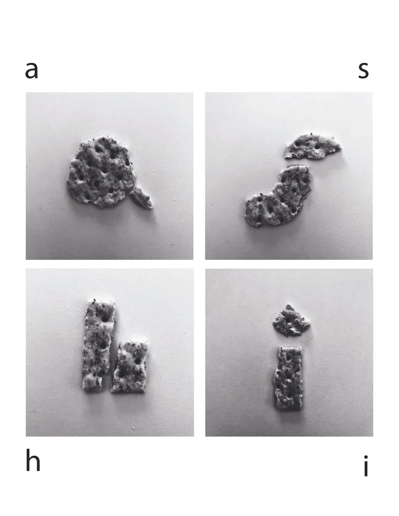
The process began with a playful idea. I was using crackers to shape letters. This tactile experiment explored texture, form, and each letter’s personality.
-
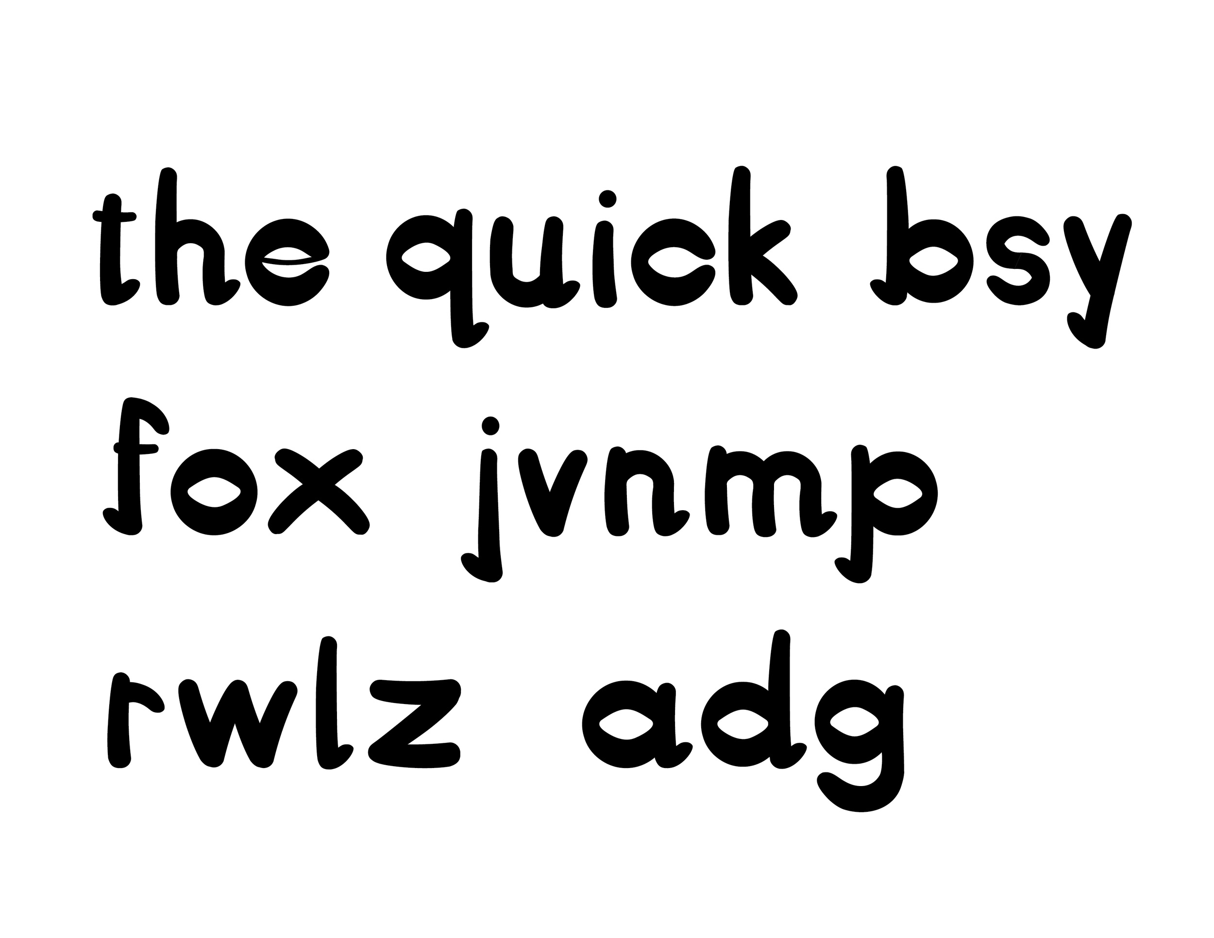
Based on the first few forms, I established structural rules and expanded the system into a full lowercase set, testing rhythm, balance, and consistency.
-

The final version evolved into a vibrant, animated alphabet. Each letter became part of a visual system that captures the project’s playful and expressive tone.