

Experiment for GUI: The Mesh System
Project TypeIndividual UX/UI Project
YearSep-Dec 2025
LocationDimensions:My RoleEnd-to-End Product Design
Software and techniques usedFigma – interface structure, prototyping, and motion mapping
After Effects – motion simulation and interaction visualization
Illustrator / Photoshop – system diagrams and visual assets
Project Description1920 * 1080 px
Raleigh,NC
The Mesh System is an experimental concept built on GenUI (Generative User Interface), a framework that designs itself in response to user behavior. The goal of this project is to explore how AI-driven systems can move beyond static layouts and become adaptive, temporal, and context-aware environments. Instead of viewing screens as fixed, Mesh treats the interface as a living ecosystem where information expands, collapses, and reorganizes through time and interaction.
UX/UI DesignDesign Problem
Traditional interfaces often trap users in linear workflows, making it difficult to track context or compare evolving decisions. Users lose sight of how past actions influence current outcomes, especially when dealing with dynamic, AI-generated data. The design challenge was to visualize time, uncertainty, and decision evolution in a way that remains interactive and understandable.
User Persona

Laurel, a design researcher, uses Mesh to manage her personal and professional tasks. She values clarity, context, and continuity in digital systems. Currently, she’s planning a New Year trip, and Mesh helps her visualize her travel decisions, from setting budgets and choosing destinations to reviewing how her earlier decisions influenced current recommendations.
Goals:
Understand how past decisions affect current outcomes.
Quickly recall context while exploring new information.
Move fluidly between detailed and global views.
Pain Points:
Losing track of context in complex systems.
Difficulty comparing historical decisions with new AI-generated suggestions.
Overwhelming visual clutter occurs when too much information stays on screen.
User Flow
Manuscripts
Every complex system begins with a thought on paper. To tackle the challenge of visualizing "time and uncertainty," I used hand sketches to rapidly iterate on ideas, exploring the most natural interaction models between humans and generative AI. These manuscripts capture the raw thought process at the very inception of the Mesh concept.
Low-fidelity Wireframes
The goal of this phase was to translate abstract mental maps into concrete interface skeletons. I experimented with three distinct interaction models to handle complex travel data, ranging from conversational guidance to spatial mapping. The final design is not a continuation of just one, but a synthesis of all three, extracting the most efficient visual patterns and navigation logic explored here.
Design Process
Versatile Gestural Interpretation
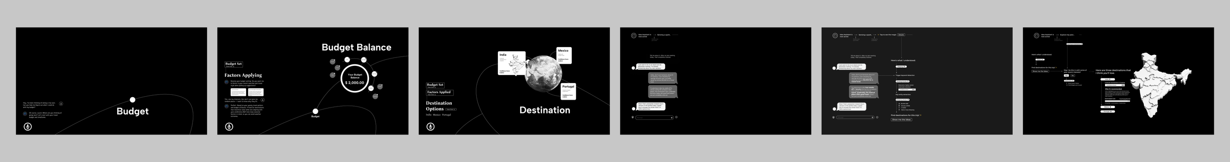
Stage 1 focuses on establishing the physical language between the user and the Mesh system. I structured the interaction framework into four functional pillars: Navigation, Action, Transform, and Custom—the latter specifically designed for nuanced behaviors, such as "Just-in-Time Quieting." This framework is operationalized through a versatile gesture library, ranging from foundational inputs such as Swipe, Rotate, and Zoom to complex commands like Hold & Drag and Quiet, ensuring intuitive control over generative content.
Stage 1 – Gesture & Just-in-Time Quieting
The Gesture and Just-in-Time UI Quieting exploration follows the user’s process of managing her travel budget and setting preference factors that shape destination recommendations within the Mesh system.
Scenario Video
Key Interfaces
Stage 2 – Multi-Agent Uncertainty & AI / Non-AI Signaling
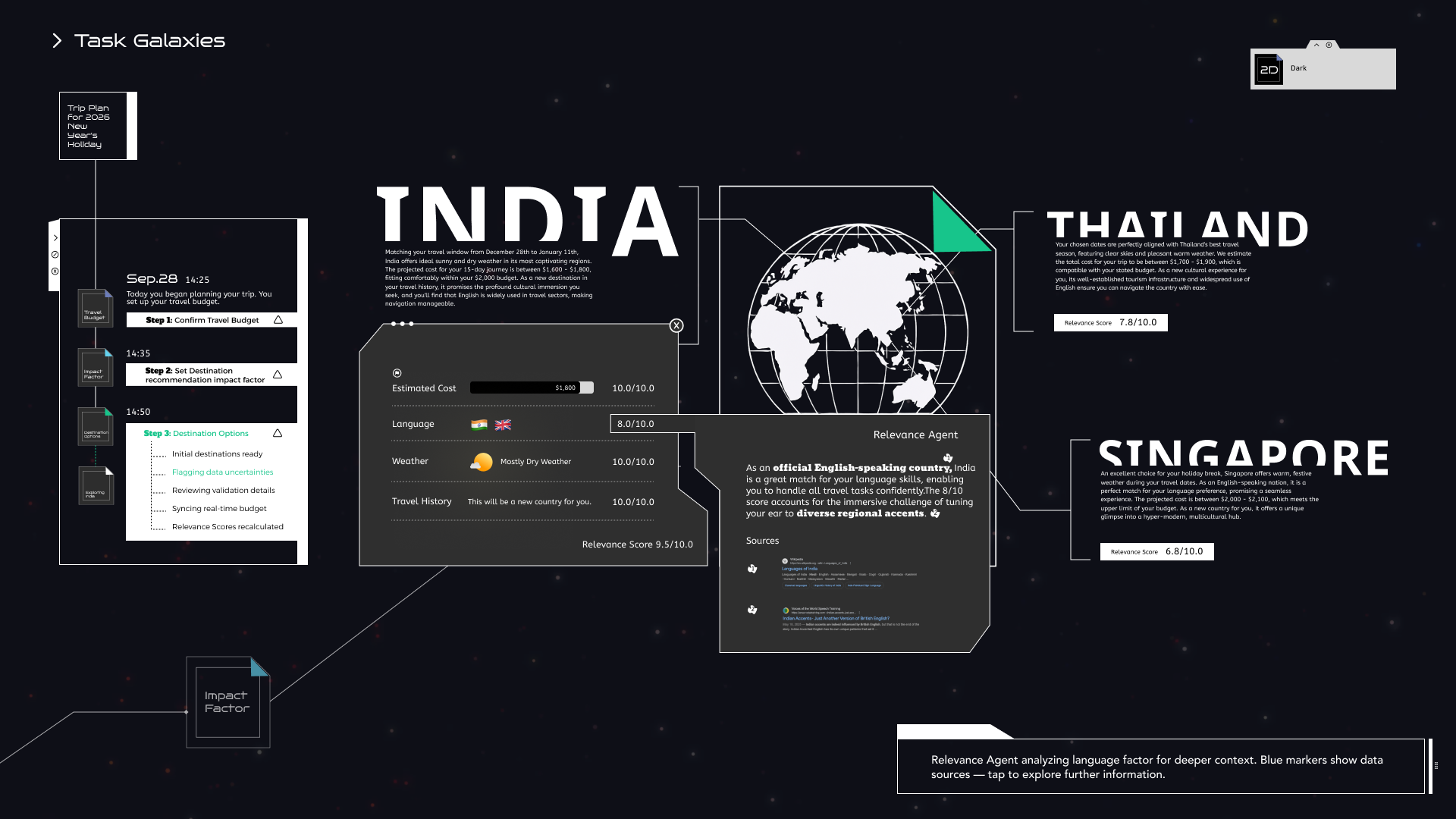
After Laurel set her preference factors, Mesh generated three travel destinations — Thailand, Singapore, and India. In this stage, Multiple Agents collaborate to make uncertainty visible and to distinguish between AI-generated and non-AI-referenced information.
Multi-Agent Uncertainty — System logic
Generative AI is inherently probabilistic, not deterministic. When Mesh generates travel recommendations, the primary uncertainty lies in the validity of the output: Are these destinations viable options, or merely hallucinations? To bridge this trust gap, a Multi-Agent architecture is introduced to address two core questions: "Is the generated content accurate?" and "Does the location truly meet the user's needs?" Specifically, the Validation Agent verifies factual integrity, while the Relevance Agent evaluates contextual alignment. Only after this dual verification does uncertain raw data become a trusted recommendation.
Multi-Agent Uncertainty—Visualizing Uncertainty
The challenge in visualizing "uncertainty" lies in balancing signaling with legibility. I explored various typographic treatments to flag AI-estimated data without obstructing the reading experience. After six iterations, Style 6 was selected as the optimal solution. It effectively communicates that the data is tentative while keeping the text clear and accessible, ensuring users are aware of the uncertainty without losing the context.
Key Interfaces
Stage 3 – Temporal Elevation Layering, Collapse Gradations & Emergent Meaning Pathways
Laurel moves deeper into the Mesh system to explore where to go within India. She wants to look back and understand how her previous travel decisions were made. Through Temporal Elevation Layering, Information Collapse Gradations, and Emergent Meaning Pathways,the system lets Laurel browse her past decisions and see how her trip planning evolved.
Timeline-Based Navigation - Text-based Interaction and Symbolic Navigation
The timeline panel shows user actions through time, capturing when and what decisions were made. Each step expands to show brief summaries and can be clicked to revisit that moment in context.
The surrounding planets serve as symbolic links to sub-tasks and overall goals. Clicking on smaller planets brings users to detailed subtasks, while the main planet zooms out to show the entire journey.
Multi-Level Display and Infinite Zoom History
A spatial UI organized into three tiers: timeline markers at the top for context, an active exploration view in the center, and a blurred "return layer" at the bottom. This structure anchors the user in the present while allowing freedom to roam the past.
A continuous scroll interaction that treats time as depth. Users zoom out to reveal past journey stages and hidden connections within a single, unified view, eliminating the need for page navigation.
Information Collapse Gradations
The system employs Information Collapse Gradations to dynamically manage density. Built on a three-layer stack—fixed info, active view, and current task—core elements like the timeline collapse to prioritize focus. For deeper exploration, the interface supports granular disclosure: hovering over planet belts reveals brief summaries, while a summary slider allows users to expand details within denser moments.
Key Interfaces
Stage 4 – Global Stylistic Settings & Accessibility Controls
Laurel opens the Mesh System and notices a new update: system-level style switching and accessibility controls. She experiments with different modes, themes, and visibility settings, watching how the interface transforms while its underlying information relationships remain stable.
Theme Switching – Dark and Light Environments
The Mesh interface is designed to adapt to both environmental context and user preference without compromising utility.
Across Dark and Light themes, layout and spacing remain consistent, while contrast ratios are dynamically adjusted for optimal legibility. Crucially, accent colors like "Mesh Green" remain consistent, serving as a visual anchor.
Spatially, the system transforms fluently between dimensions. 3D Mode visualizes tasks as glowing planets in orbit, offering depth and hierarchy. In 2D Mode, these organic forms flatten into simplified nodes and dotted edges, stripping away visual noise to focus purely on the structural relationships between tasks.
Verbal Rule Set – Text Size
This interface is primarily text-based and box-based, with information conveyed through typographic hierarchy, structured containers, and clearly defined boundaries rather than color, imagery, or decorative effects. As a result, accessibility considerations in this system focus on typography and structural strokes as the primary levers for supporting diverse visual needs.
To accommodate varying levels of visual acuity, the system employs a strict verbal rule set for text scaling rather than ad-hoc adjustments.
Text Size Controls rely on a Fixed-Ratio Scaling Engine. Instead of arbitrary resizing, four calibrated presets scale the entire typographic stack (headings, labels, body) simultaneously. By adhering to a unified +2 / –2 scaling rule, the system ensures that hierarchy remains stable—preserving the relationship between parent and child elements even at maximum magnification.
Default text size.
Baseline typographic scale under standard viewing conditions.
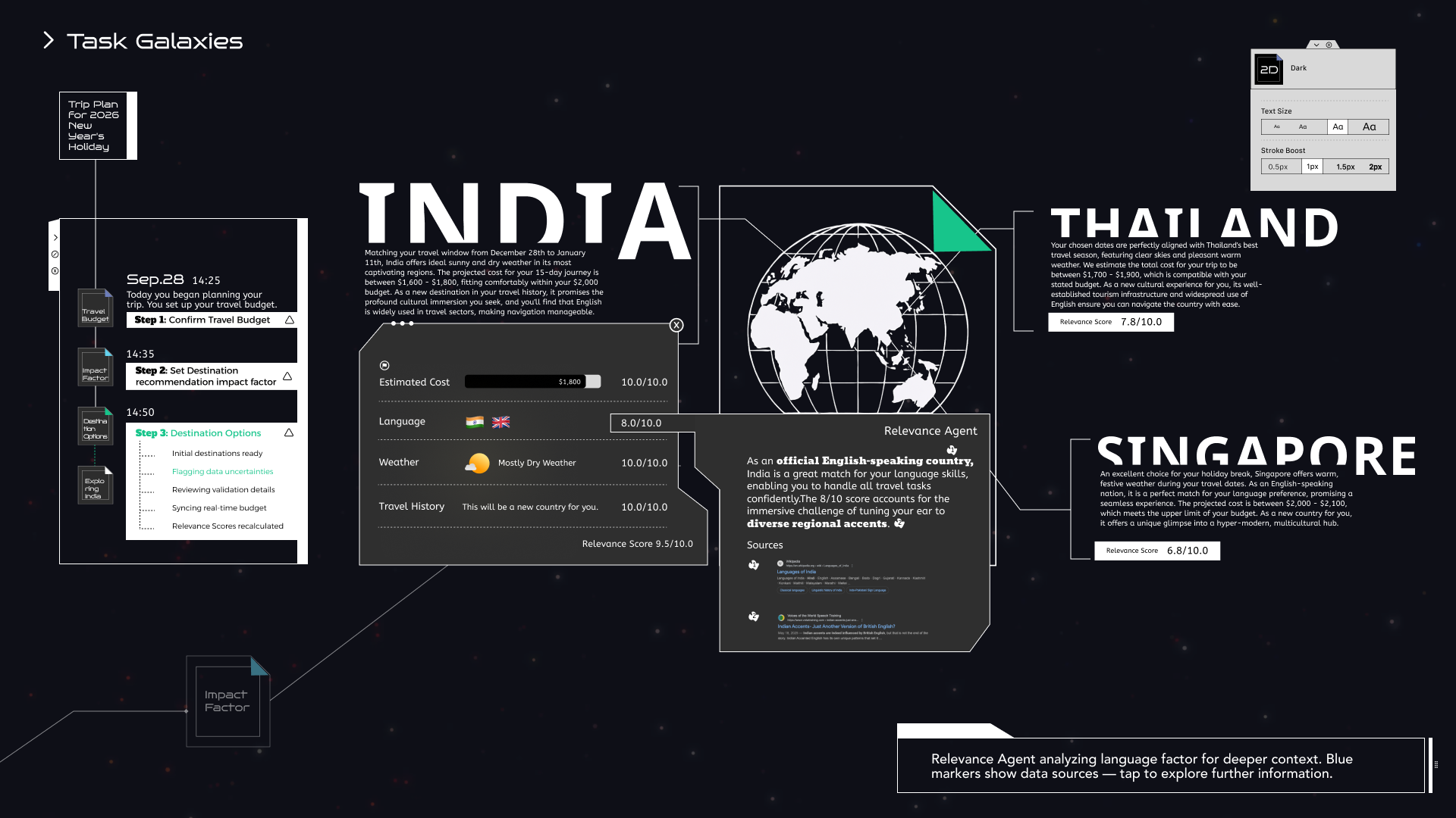
Text size +2
Increased text size with preserved hierarchy through fixed-ratio scaling.
Verbal Rule Set – Stroke Boost
Stroke Boost addresses contrast sensitivity. Users can adjust outline weights across four levels (0.5px to 2px). This boost dynamically thickens structural elements like timelines, orbits, and cards, enhancing boundary definition for low-vision users without breaking the visual harmony.
Default stroke weight (1px)
Baseline outline thickness for structural elements under standard contrast conditions.
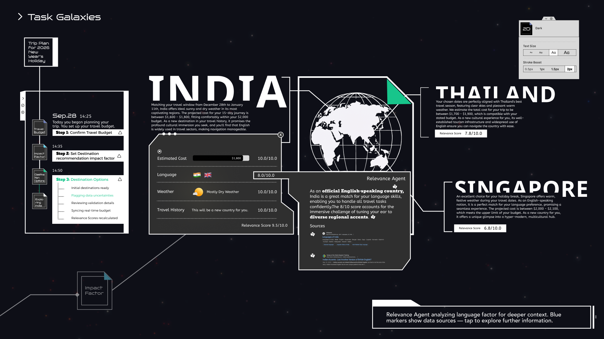
Stroke Boost – 2px
Increased outline thickness is applied to structural elements, improving boundary clarity while preserving overall visual harmony.
Key Interfaces